CONFIDENTIAL SECTOR
Confidential Infographic
Design Lead

Project Background
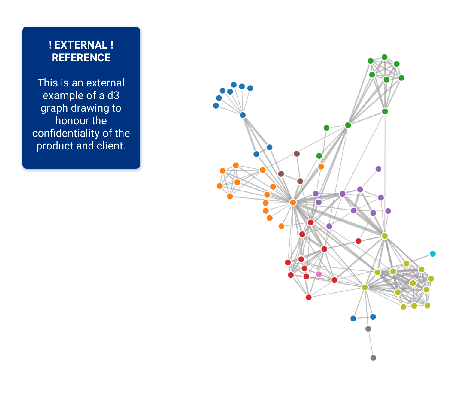
! Please note: due to client confidentiality requirements, I am unable to share visual material of this project !
I was brought onto the team as a design expert after the tool had been developed for the previous two years without any design input, resulting in a functional, but not a user-friendly asset.
As the UX design lead I implemented four main design principles into the project:
Introducing and educating on user-centred ways of working
Leading the design and documentation process of new requirements
Evaluating and redesigning the existing UI & UX functionality to make the MVP usable
Establishing unbiased User Research to uncover real user needs and resulting required user journeys
Tools used include: Sketch; Invision; Mural; draw.io; Confluence.

Design Workflow
I established a design led workflow to integrate a user-centred process to existing and new functionality, ensuring that the project stakeholders clearly understood the process required to establish usability. Further, this was used as a checklist for the definition of ready for development from a design perspective.

Heuristic Evaluation
I conducted an end-to-end heuristic evaluation of the tool to assess the usability and define required iterations on the existing features and journeys. The severity ratings naturally offered a backlog prioritisation.
Based on the usability flaws I discovered in the tool, the heuristics I chose to rate features against were:
User control and freedom
Consistency and standards
Aesthetic and minimalist design
Recognition rather than recall
Flexibility and efficiency of use
Help and documentation

User Research & Testing
I established a unbiased user research and testing approach to discover true user needs, as well as test the current usability of the tool and user’s digital inclusion ratings.
The research uncovered that the tool did not only need usability improvement, but also concept iterations and additions to truly serve the users.
Tools used: Invision; Teams; Confluence.
Methodology:
Usability Testing
Cognitive Walkthrough
A/B Testing
Hypothesis Testing
Card Sorting
Co-Designing
Accessibility Testing
Ethnographic Research: Observation through shadowing
Interviews
Focus Groups

Discovery Artefacts
As the product was initially set up as a PoC, the project did not conduct a discovery phase to establish users, their needs, pain-points, or journeys.
In order to set a clearer direction for requirements and to establish empathy with the product’s users amongst the wider project team, I created these artefacts retrospectively. The main source of insight for these outputs were research insights as well as Design Thinking Workshops, conducted with the Business Analysts and Super Users.
Artefacts created include:
User Profiles
Stakeholder Map
User Journey
User Needs

Accessibility Review
In order to satisfy the WCAG AA accessibility standards, I had to establish an extensive accessibility review of the tool. Due to the confidentiality of the tool, it was not possible to test the developed version with users that had accessibility needs.
Besides automated testing of the code base through lighthouse, I created an extensive list of design verification methods, spanning from User Experience to Content Design to Visual Design. Further, the tool has been tested through a screen reader, a speech recognition tool and a screen magnifier, as recommended by the Goverment Service Manual.

Atomic Style Guide
Due to the combination of bespoke components, the material.io design system and several design inspirations such as Neo4j, the tool lacked consistency, visual hierarchy and clear calls to action.
While re-designing the UX of the different journeys, I additionally redesigned the UI styling of the tool.
This included:
Responsive Layout
Visual Design of bespoke components
Consistency in design system per component type
Typography
Colour Scheme
Logo
Prototyping
The tool was prototyped and iterated in Sketch and shared with stakeholders, developers and users through Invision. The development team used the inspect mode to receive component specs.
Sketch was used to create reusable assets through the the component library functionalities ‘Symbols’, ‘Text’, ‘Layers’ and ‘Colours’, in order to decrease prototyping time taken.

Performance Improvements
Due to the lack of understanding of the user base and environment requirements when the project was initially set up, the front- and back-end of the product did not scale up to the amount of data needing to be displayed.
As only minimal improvements could be made from a back-end perspective, a redesign of the user journey and data loading experience had to be undertaken in order to deliver a faster and ultimately more functional interaction. The main goals were loading in significantly less data and creating a more intuitive exploration journey.
Key journey improvements made were:
Launch Screens
Insightful and interactive summary infographics to show “everything”
Hierarchical and persistent unpacking and packing of nodes
Advanced analysis options
Filters highlight instead of remove to show context

Result
After over two and a half years of development time and 7 months after joining the team, the tool is delivering the MVP version as a user friendly application.
The tool has been redesigned and a backlog of post-MVP designs and concepts has already been established.
The tool in its redesigned format was described as a ‘flagship project’ and was said to provide ‘a world-leading capability’ in the client’s public annual report 2020.
“Meike joined the team at a point when we had a functioning version of the tool, but I think we all had an awareness that the tool is complex, it can be rather “intimidating” for users, and there was scope to make improvements in terms of its usability and its accessibility (in the widest sense). Since joining the project, Meike has done a terrific job in helping us to make massive improvements to the user interface and overall user experience for the CNI KB. Her contribution has been really outstanding, and I believe it has helped to create a tool that is not just functional, but which users actually want to use – which I believe is extremely important for a tool of this type.”
“Meike has done a fantastic job ensuring the delivery team and client stakeholders understand the value of good design as she got started with reviewing the existing flows and designs. She methodically went through an overall heuristic evaluation of the system and provided a clear roadmap of her priorities, covering best practice such as effective access to users & feedback loop, new workflows for upcoming features to be prototyped and tested before deemed ready for development and educating the client on fundamentals of accessibility and usability issues.”